I saw a lot of forums that some people are having big problems with CSS and am not sure why.
Am not CSS expert but i have learned css with javaFX I did not know how to use it before i met javaFX, i did not know what are selectors, pseudo classes…
In this post I will talk about my experience with CSS and JavaFX, how i learned it, my experiments, what I have been noticing, trying to accomplish and other stuff.
I remember when i met javaFX 1.2 CSS seemed so hard to me i though i will never try to use CSS, but i have tried and i like it. Here is some basic tutorial on css for more advanced use this .
For me the most important class is Region and Node it is always good to know/remember their CSS properties others like Shape will be easy to remember later when u learn these two.
I will start with Region/StackPane as first class in this post.
I wrote ExtendedApplication class so I don’t have to type same code allover again, i will start will simple StackPane in root of scene, why StackPane well SkinBase extends StackPane. Only CSS property in StackPane is -fx-alignment and default value is center (we all know that stack positions children in the center), Regions don’t have that property.
Here is code for ExtendedApplication
package cssPlayground.utils;

import javafx.application.Application;
import javafx.scene.Scene;
import javafx.scene.layout.Pane;
import javafx.scene.layout.StackPane;
import javafx.stage.Stage;

/**
 *
 * @author jojorabbit
 */
public abstract class ExtendedApplication extends Application {

    protected double DEFAULT_APP_WIDTH = 500;
    protected double DEFAULT_APP_HEIGHT = 400;
    protected Stage stage;
    protected Pane root;
    protected Scene scene;

    @Override
    public void start(Stage primaryStage) {
        preSetup(primaryStage);
        setup();
        postSetup();
    }

    protected abstract void setup();

    protected void preSetup(Stage primaryStage) {
        stage = primaryStage;
        stage.setTitle(getAppTitle());
        root = new StackPane();
        root.getStyleClass().add("root-pane");
        scene = new Scene(root, getAppWidth(), getAppHeight());
        stage.setScene(scene);
        setupCss();
    }

    protected void postSetup() {
        stage.centerOnScreen();
        stage.setVisible(true);
    }

    // override to change APP WIDTH
    protected double getAppWidth() {
        return DEFAULT_APP_WIDTH;
    }

    // override to change APP HEIGHT
    protected double getAppHeight() {
        return DEFAULT_APP_HEIGHT;
    }

    // override to set App Title
    protected String getAppTitle() {
        return "Test";
    }

    // override to add CSS styles
    protected void setupCss() {
    }
}
And the starting sample code
package cssPlayground;
import cssPlayground.utils.ExtendedApplication;
import javafx.scene.Group;
import javafx.scene.layout.StackPane;
/**
 *
 * @author jojorabbit
 */
public class CssTest001 extends ExtendedApplication {
    StackPane cssNode;

    public static void main(final String[] args) {
        launch(CssTest001.class, args);
    }
    @Override
    protected void setup() {

        cssNode = new StackPane();
        cssNode.getStyleClass().add("custom-node");
        cssNode.setPrefSize(300, 300);
        root.getChildren().add(new Group(cssNode)); // adding to group so root does not resize custom node
    }
    @Override
    protected String getAppTitle() {
        return "CSS Test 001";
    }
    @Override
    protected void setupCss() {
        scene.getStylesheets().add("/cssPlayground/csstest001.css");
    }

}
csstest001.css
.custom-node {
    -fx-background-color: skyblue; /* set background to skyblue */
    -fx-border-color: red; /* set border to red*/
    -fx-border-width: 3; /* border width 3px */
}
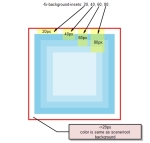
And resulting image with comments

This is just the most simple example, it is good to know color functions and other color specifications.
Most (I would rather say all) of JavaFX controls are made of multiple backgrounds.
Lets see how to make multiple backgrounds.
Adding multiple backgrounds is easy just specify multiple colors in -fx-background-color and add some insets CSS ref says for insets : “A series of size values or sets of four size values, separated by commas. A single size value means all insets are the same. Otherwise, the four values for each inset are given in the order top, right, bottom, left. Each comma-separated value or set of values in the series applies to the corresponding background color.”
.custom-node {
    -fx-background-color: skyblue, derive(skyblue, 25%), derive(skyblue, 50%), derive(skyblue, 75%);
    -fx-background-insets: 20, 40, 60, 80;
    -fx-border-color: red; /* set border to red*/
    -fx-border-width: 3; /* border width 3px */
result is this :
 for example adding negative values to insets means insets “go” to other way try: -fx-background-insets: -20, 40, 60, 80;
first rectangle (one with not derived skyblue color will go outside of border), most of javaFX controls are made like this but with low insets values
will show how to accomplish that later.
Also we can add multiple borders to custom node, if we want to accomplish that each “skyblue” rectangle has border then border insets have to be added too
.custom-node {
    -fx-background-color: skyblue, derive(skyblue, 25%), derive(skyblue, 50%), derive(skyblue, 75%); /* set background to skyblue */
    -fx-background-insets: 20, 40, 60, 80;
    -fx-border-color: red, yellow, green, blue; /* set border to red*/
    -fx-border-insets: 20, 40, 60, 80;
    -fx-border-width: 3; /* border width 3px */
}
Nothing much to explain only to say if border insets is not same as background insets result won’t be as expected.
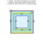
Well lets try a little bit more complex (I mean complex for beginners) example here is what i want to accomplish.
 tips
tips
1. example: use -fx-border-radius and -fx-background-radius -> see Region css properties
2. example: use border color
3. example: use insets
Answers:
1. Example:
.custom-node {
    -fx-background-color: skyblue, derive(skyblue, 25%), derive(skyblue, 50%), derive(skyblue, 75%); /* set background to skyblue */
    -fx-background-insets: 20, 40, 60, 80;
    -fx-background-radius: 20 0 0 0, 0 20 0 0, 0 0 20 0, 0 0 0 20;
    -fx-border-color: red, yellow, green, blue; /* set border to red*/
    -fx-border-insets: 20, 40, 60, 80;
    -fx-border-radius: 20 0 0 0, 0 20 0 0, 0 0 20 0, 0 0 0 20;
    -fx-border-width: 3; /* border width 3px */
}
2. Example:
.custom-node {
    -fx-background-color: skyblue, derive(skyblue, 25%), derive(skyblue, 50%), derive(skyblue, 75%); /* set background to skyblue */
    -fx-background-insets: 20, 40, 60, 80;
/*    -fx-background-radius: 20 0 0 0, 0 20 0 0, 0 0 20 0, 0 0 0 20;*/
    -fx-border-color: red transparent red transparent, yellow, transparent green transparent green, blue transparent blue transparent; /* set border to red*/
    -fx-border-insets: 20, 40, 60, 80;
/*    -fx-border-radius: 20 0 0 0, 0 20 0 0, 0 0 20 0, 0 0 0 20;*/
    -fx-border-width: 3; /* border width 3px */
}
3. Example:
.custom-node {
    -fx-background-color: skyblue, derive(skyblue, 25%), derive(skyblue, 50%), derive(skyblue, 75%); /* set background to skyblue */
    -fx-background-insets: 20, 40 40 20 40, 40 60 60 60, 80 80 60 80;
/*    -fx-background-radius: 20 0 0 0, 0 20 0 0, 0 0 20 0, 0 0 0 20;*/
    -fx-border-color: red, yellow yellow transparent yellow, transparent green green green, blue blue transparent blue;
    -fx-border-insets: 20, 40 40 20 40, 40 60 60 60, 80 80 60 80;
/*    -fx-border-radius: 20 0 0 0, 0 20 0 0, 0 0 20 0, 0 0 0 20;*/
    -fx-border-width: 3; /* border width 3px */
}
Well with CSS a lot of stuff can be accomplished easy like shaping see -fx-shape property. To shape our node to circle we can use high background-radius values.
I my last post about ListComboBox you can see how is arrow/triangle made with -fx-shape, for shapes i use paint, illustrator or similar tools to get x/y coordinates or to get SVG path.
.custom-node {
    -fx-background-color: skyblue, derive(skyblue, 25%), derive(skyblue, 50%), derive(skyblue, 75%); /* set background to skyblue */
    -fx-background-insets: 0, 60, 80, 100;
    -fx-background-radius: 20.0em, 0, 0, 0; /* 1.0em == 12 px*/ /* 20.0em == 240px*/
    -fx-border-color: red, yellow, green, blue;
    -fx-border-insets: 0, 60, 80, 100;
    -fx-border-radius: 20.0em, 0, 0, 0;
    -fx-border-width: 3; /* border width 3px */
}
If you like to play with CSS you will see how easy you can make a lot of stuff with it.
Example:

I will explain segments function later in some other post you will see how similar it is to one of shape properties
For derive function see color functions in CSS Reference
.custom-node {
    -fx-background-color: skyblue, derive(skyblue, 25%); /* set background to skyblue */
    -fx-background-insets: 0, 20;
    -fx-background-radius: 10, 0;
    -fx-border-color: blue, red;
    -fx-border-style: segments(40, 4, 20, 4) phase 12 line-cap butt, segments(26, 4, 26, 4) phase 4 line-cap round;
    -fx-border-insets: 0, 20 22 20 22;
    -fx-border-radius: 10, 0;
    -fx-border-width: 5, 5 0 5 0;
}
Well that is it for the first part of the CSS Styling series, fee free to leave come some comments, critics, … If i forgot to cover something feel free to contact me.
Next part continues Region CSS properties for image backgrounds, image borders. You can found it here (Currently in progress).

Pingback: Java desktop links of the week, July 18 | Jonathan Giles
Pingback: JavaFX links of the week, July 18 // JavaFX News, Demos and Insight // FX Experience
Nice article..it really helped me to understand how CSS works….waiting for part 2
Thanks. Part 2 will be out soon.
Nice article. Helped a lot in understanding the basic javafx css implementation.
When we can expect part 2 ? 🙂
Thanks. It is in draft i just need to add some stuff to complete it.
Pingback: JavaFX 2.0 CSS Styling Part 2 | jojorabbitjavafxblog
Where did you put that: “/cssPlayground/csstest001.css”, I can’t load it?
Just put it in same folder where is java file. And be sure that it is properly added to scene stylesheets.
Very useful for CSS understanding.
Thanks.
Pingback: JavaFX 2.0 CSS Styling Part 2 « CSS Tips
Great post! Easy read, good examples and 10 minutes later CSS is working perfectly for my application!
Thank you very much!
– Pat
Pingback: JavaFX 2.0 CSS Styling Part 2 JavaFX 2.0 CSS Styling Part 1 JavaFX 2.0 Custom ComboBox JavaFX 2.0 Deck Pane Control | CSS Tips